
Search site
Web page Analysis
Positive points of view
- good use of colors
- buttons are not confusing/easy to use
- simple to use
- layout is somewhat simple
The site is realitively simple but there are thinghs they ciuld do is buttons on the right are too many in numbers and are not useful to some extent there page tends to be to long and should be shortened the some of the ads they have been in a better place thene where they had it
Content aspects
The purpose of you tube is to view post but as of recent it has been more of a soical networking the site has many the content is universal so it can be realated to almost anty thing that
The ideal purpose of you tube used to where you could make and show the world the videos you had either made or worked on but the recent times is that the site can be use for educational in someway but is depending what you do with videos For the most part of youtube science the begging is that it has been used for entertainment purpose
The target audience would be open to everyone because there is almost no bounds to what can be found on youtube it self
The site it self can be full of content but it all depends on what you look for because there might be 10,00o videos on film making well there is only 10 on drawing. The ads can be distracting at times or just too annoying to deal with but it is only a new thing they have added recently.
Infomation on youtube that you can find is not a rellieable source only 15-20% of the time can it help with some
youtube has fulfilled it purpose to me because it was created to have a world wide base for all videos
The most receint update was for the whole site it change the style the layout and other missaluines things
All the videos that get put on to youtube tend to bring back the people who have visted it before
Design aspects
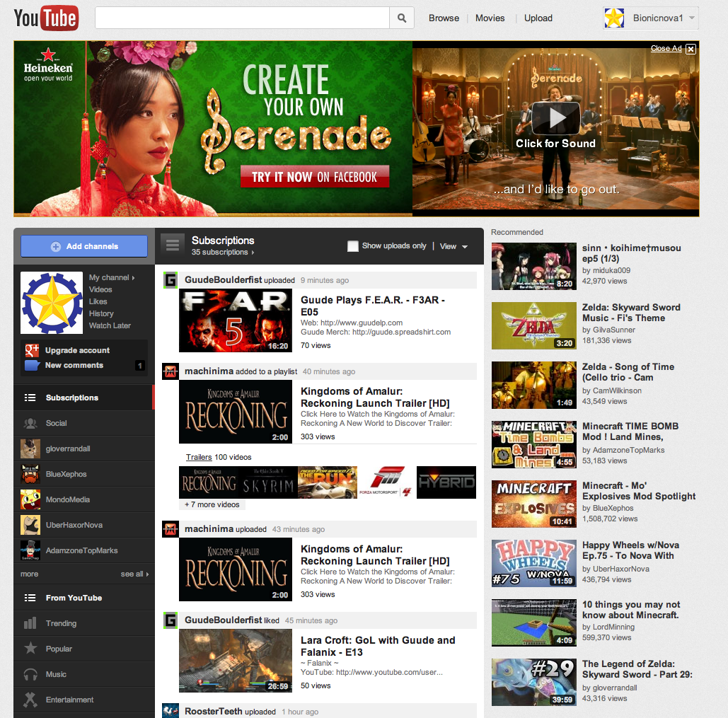
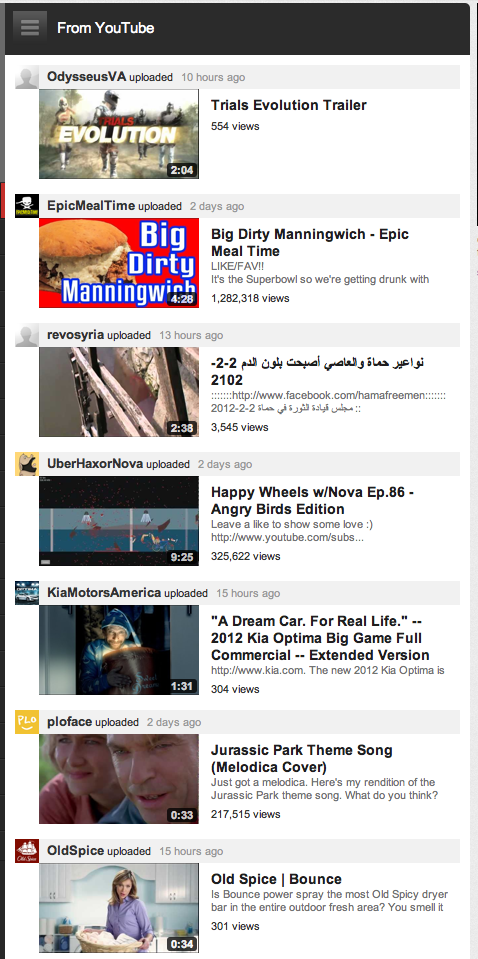
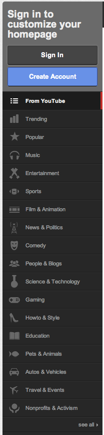
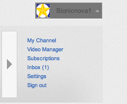
Youtube has always been a simple and faily attractive site not many adds not going over board of color or flasy ads organized to an extent (user error) in genral item on the page are proprely place to understand them. the site is not overly complex simple design when it comes to the new addition to it it can be a little confuseing to what is what. the font is an ok size to understand the main color of the site is red white and a tone of grey. the site maintains the same format throughout it. the length is quite accetpable and is not overgoing long. the site has no sitemap so any navigation to use so I would say it could use one. you can find previouly visited videos the one you liked favioutred ect. the home button is in the same location. hyperlinks are various not all the same. youcan costomize your channel but that is all in the way of costomization. there is a simple and advandced search bar system on youtube
Technical aspects
images


![]()
![]()
Bad vs Good qualites
Good
- use of large clear fonts
- short pages
- proper spelling and grammer
- simple design layout
- good color contrast
- infomation (about the site yourself a company)
- good navigation
- they reconize you
- social netwok / communication (fourm chat )
- clear title
Bad
- over use of flash
- playing music
- blinking/color changing text
- pop ups
- having broken links
- new browser windows
- pre playimg videos
- faulty search bar
- not updateing often
- slow loading time